
It’s been more than a year since Google announced that mobile search traffic had overtaken that of desktops.
As a website owner or designer, the user experience is priority number one. With responsive design, you can ensure consistent user experience across all devices regardless of screen size. It works by automatically resizing, repositioning, and transforming individual page elements to fit smaller displays.
Today, most themes from site builders and content management systems already implement responsiveness to cater to mobile users. But apart from being responsive, there are also some different factors you should look for when choosing a theme such as customisation options, flexibility, scalability, and navigation features.
While most new themes are responsive right off the bat, not all of them may suit your particular preferences. Furthermore, tweaking the theme’s code to make your customisations may alter responsiveness and present design issues that are unpleasant to the eye. For example, adding a photo that floats over the header may be dislocated when the site goes into mobile view.
Of course, these issues can be fixed with the right code. You just need to be familiar with the basics of responsive design. Thanks to the popularity of WordPress, tons of free resources can help you with coding. These resources can provide you with examples as well as situation-specific tips to master responsive design. And if you’ve had experience with coding before, then understanding responsive design shouldn’t be too difficult for you.
Testing the Responsiveness of Your Site
Most—if not all—web developers and designers use a personal computer when building a website. Although it is possible to create a site in a mobile environment, it’s simply too impractical to do so. That’s why you need a seamless testing strategy within the development process that covers all screens such as tablets, smartphones, and phablets.
Fortunately, there are several cloud-based tools you can use to emulate these screens or test the user experience without having a physical device firsthand. Here are some of the best tools you can consider:
1. MobileTest.me
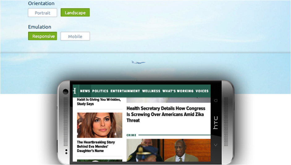
MobileTest.me allows you to check the responsiveness of your site by emulating flagship mobile devices such as the Google Nexus and iPhone. It is a fast way to check how well your site looks and feels in a mobile environment.
One advantage of MobileTest.me is that you can change the orientation of the virtual device from portrait to landscape. This way, you can see how your site looks whatever your audience is doing. You can interact with your site as well, but you do need to sign up for the premium version to access additional features such as “real” mobile emulation.
2. Am I Responsive
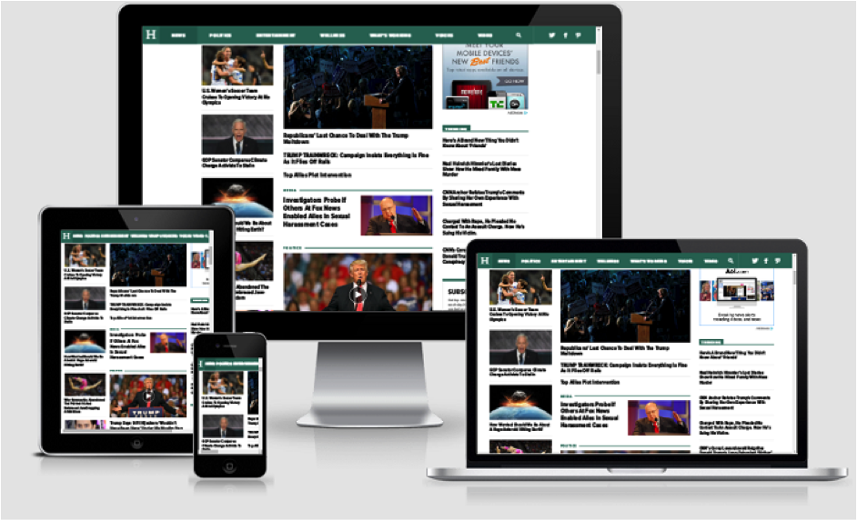
If you want a quicker way to test your site across multiple devices, then you can go for Am I Responsive. This particular tool works by emulating a desktop, phone, tablet, and laptop at the same time. Certain touch controls such as swiping left and right will also be emulated within the tool.
One disadvantage, however, is that you can’t zoom in on any of the emulated screens. This makes it difficult to look at individual page elements or check if your fonts look smooth on other screens. It shouldn’t be a problem, however, if you’re sure that these elements have optimal resolutions for clarity.
3. Google Developers – Mobile-Friendly Test
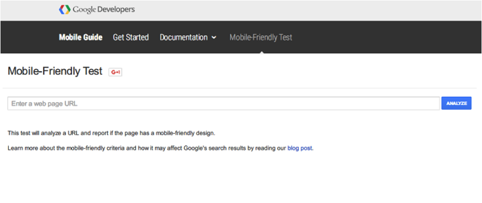
Last but not least, you can run your site through Google’s very own Mobile-Friendly Test. Unlike the other tools, you can’t interact with the emulated screen in the test. You will, however, receive insights from Google itself to learn how you can improve the responsiveness of your site as well as general tips on site design. Knowing that Google is the undisputed king of search engines, it’s a good idea to pay attention to what they have to say.
Another step to gain a quick view of your site’s responsiveness using a desktop machine is just to resize the browser window to something smaller. At about 50-60% width, the responsive elements of your page should begin to collapse into their appropriate positions. Of course, you can’t emulate the touch interface with this method, but it is an excellent way to have a quick glance at your work.
Conclusion
As technology grows bigger, screens get smaller. As marketers or developers, you have to go with the flow and become adaptive to new trends. Make sure you run your site through the testing tools mentioned above before you roll to open up your doors to the mobile audience.